
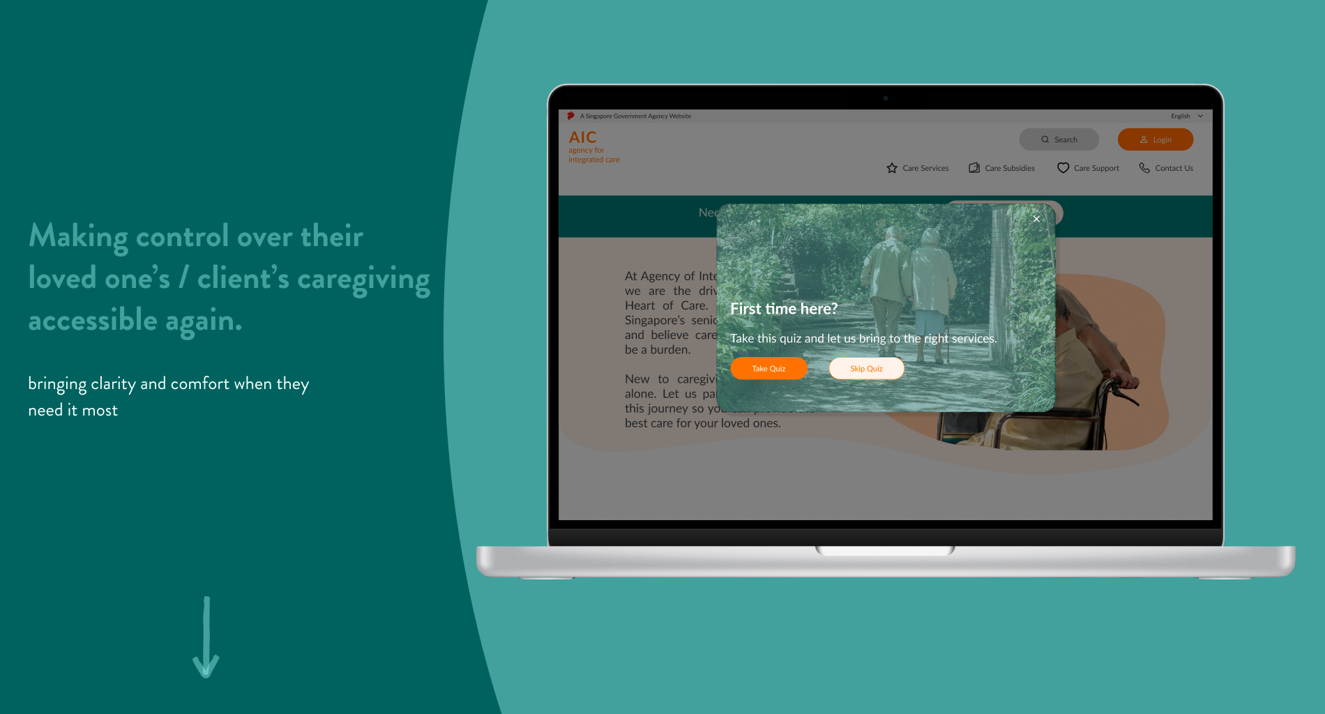
How do we create a seamless portal for caregivers and service providers to feel reassured and understood in their time of need
Overview
We designed a desktop portal for caregivers and service providers to seamless share and retrieve information to better care for their loved ones.
This case study was part of a client project at UXD35, General Assembly
Role
Generalist UI/UX Designer
UX Design, Usability Heuristic Evaluation, UX Research & User Testing, Card Sorting, Visual Design & Prototyping, Branding
14-25 March 2022
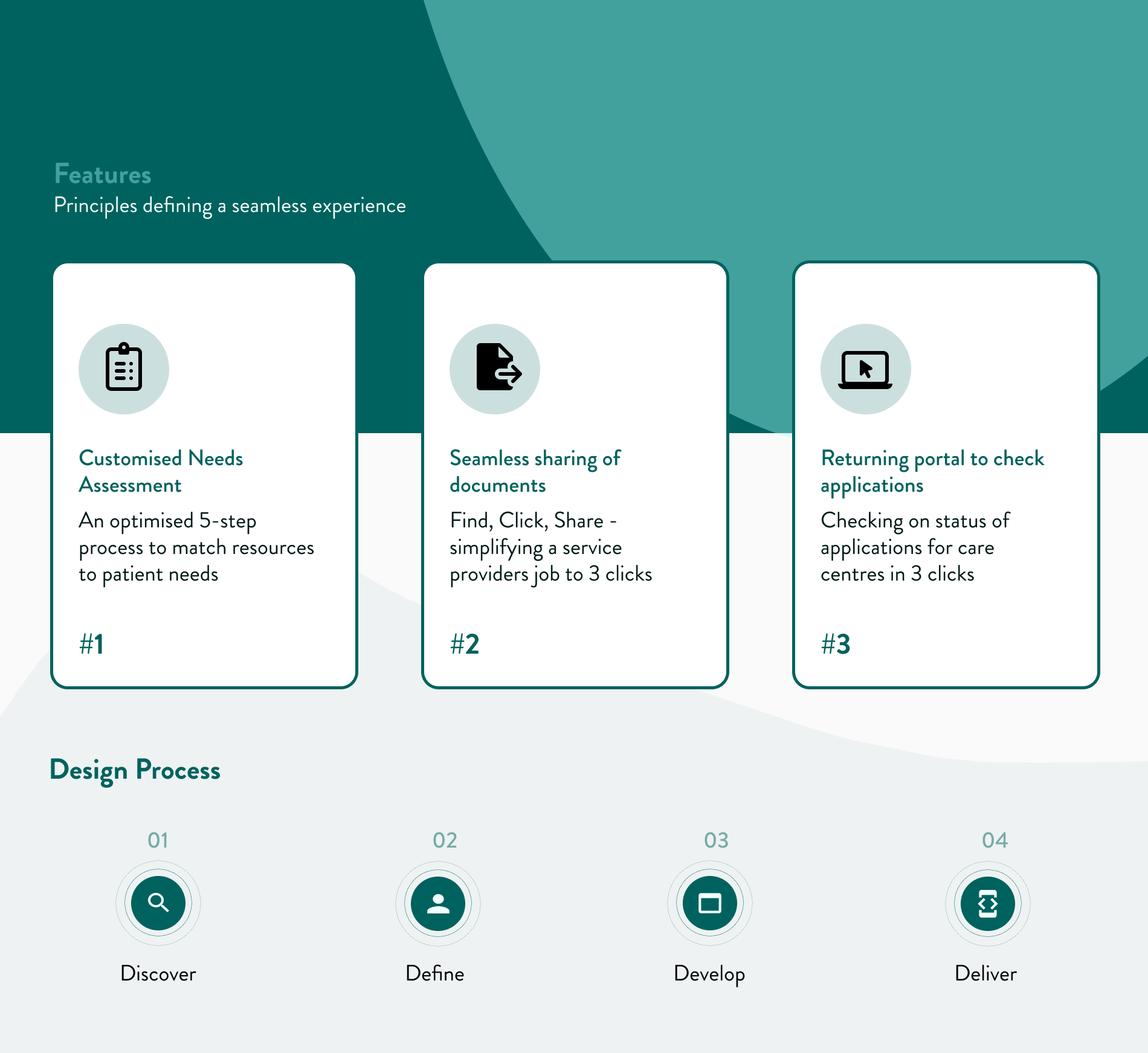
Discover
Background
Understanding the how caregivers and service providers might feel when they are looking for the resources they need
The Agency for Integrated Care (AIC) exists as the “to-go-to liason” - bridging *service providers, caregivers and patients. Their work in the community is to consolidate care services and information and make them accessible to those who need them.
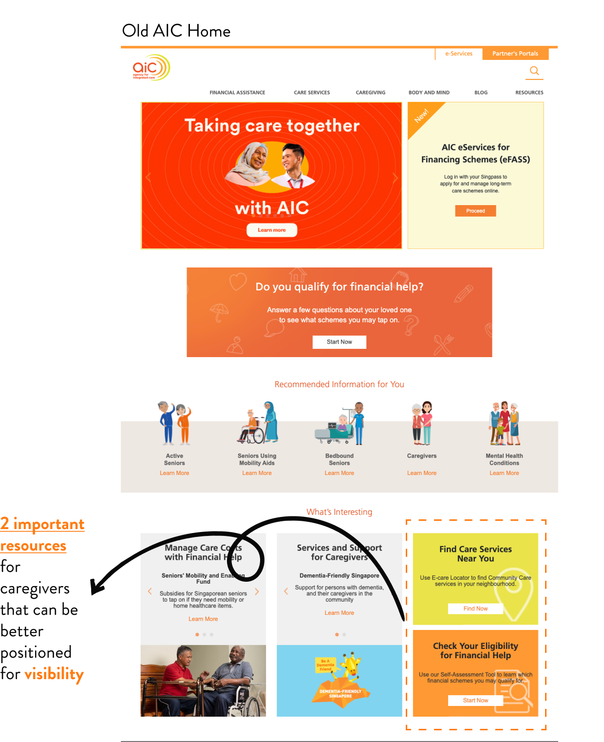
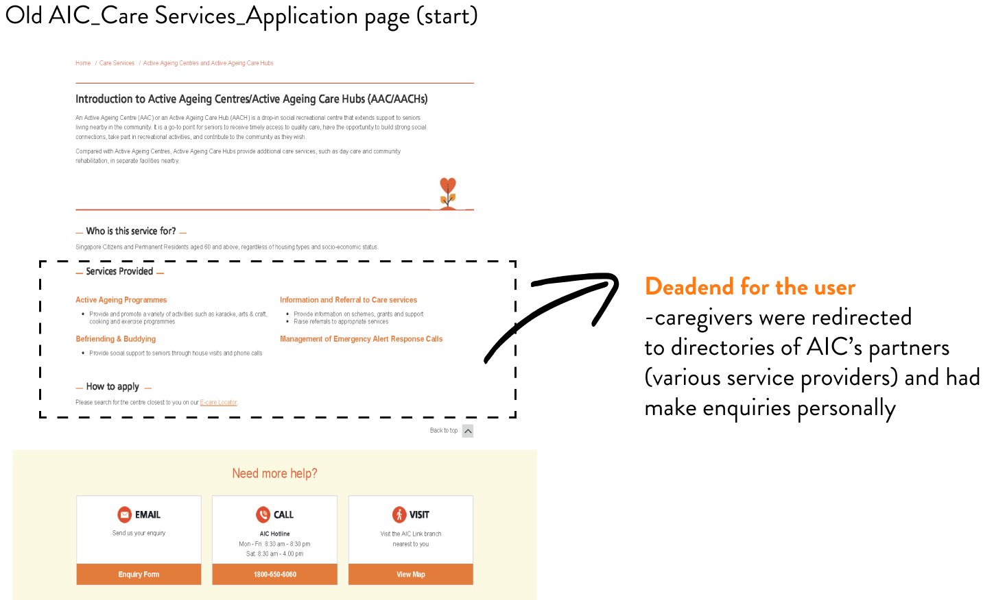
However, we found that important resources for caregivers were not visible enough. (see anotated “Old AIC Home)
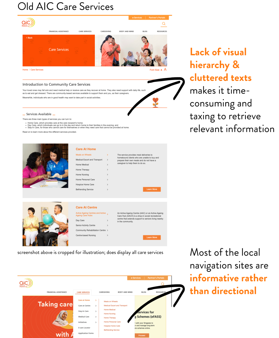
The sheer amount of resources and content meant that navigating AIC’s old website was taxing and confusing for some. The information and visual hierarchy also needed a revamped in order to declutter and simplify information for users to access
We conducted 2 rounds of user interviews with a total of 15 caregivers and service providers. We sought to understand the challenges they face in caregiving, the role of AIC for them, and how they’ve been feeling.
All they want is clarity and control find comfort in being a better caregiver
Define
UX Research
*Examples of Service Providers are day care centre managers, occupational therapists.
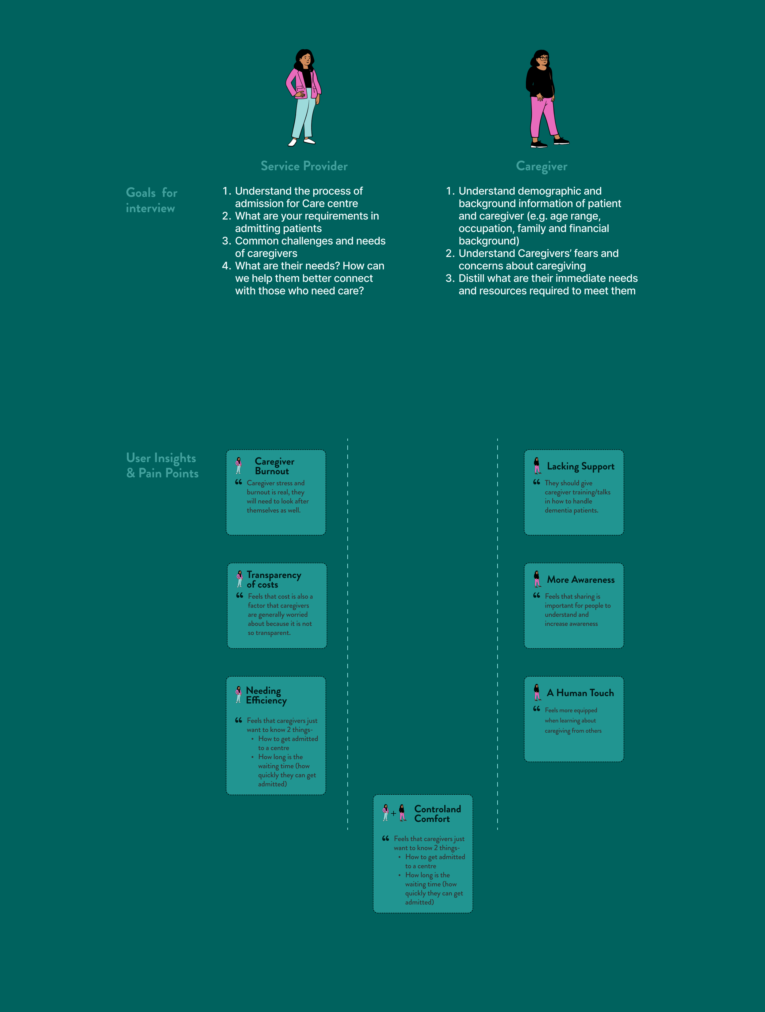

Personas
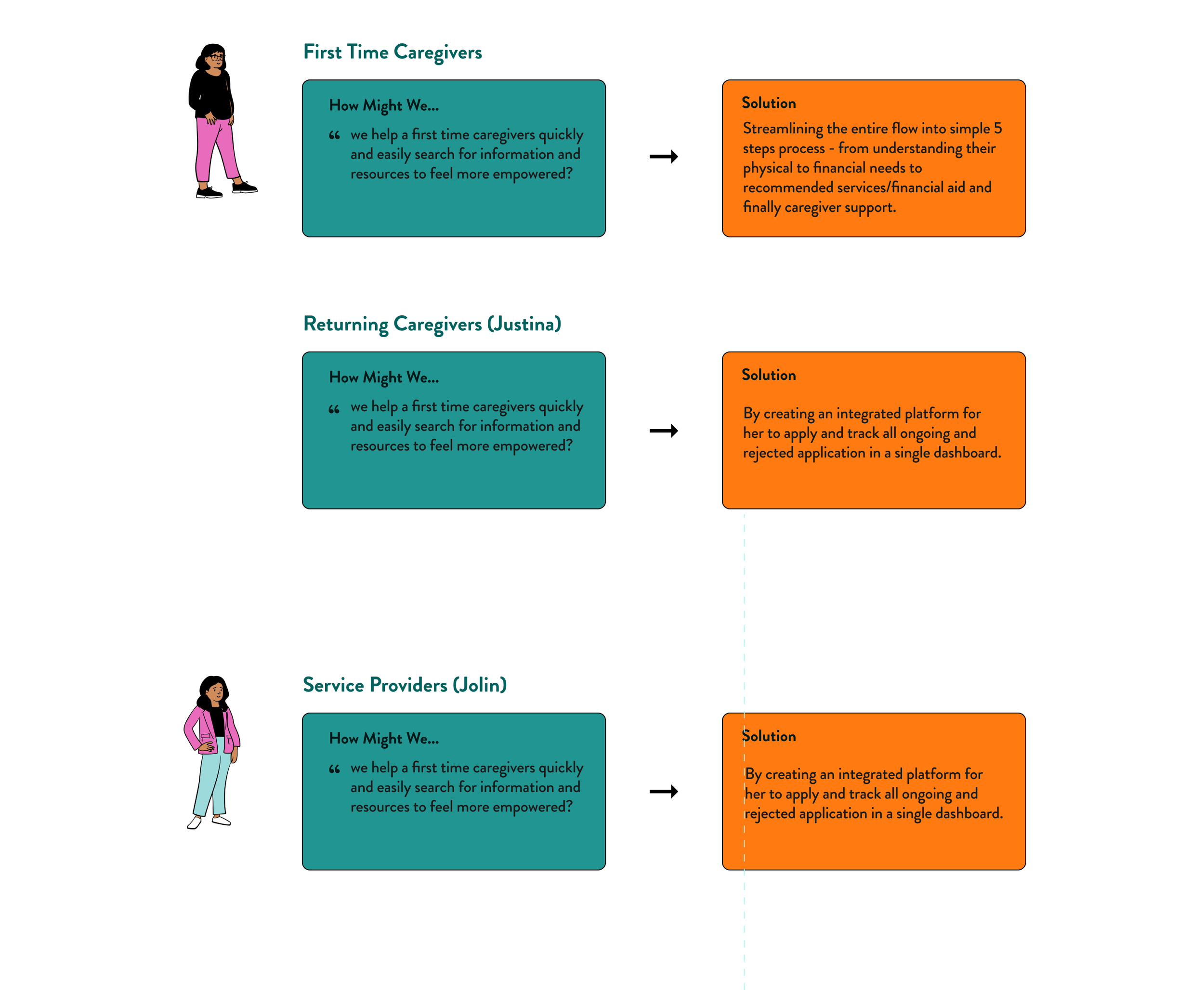
How might we design a platform that caregivers streamlines content and caregivers and service providers?
My team and I internalised the motivations and needs of both Justina and Jolin to better caregive.
We then ideated 3 targeted solutions which would form the 3 user flows in the new AIC Care Portal.
Addressing The Challenge
Develop
Through a round of design studio, we aligned our ideations of how the new care portal would look like. Drawing reference from our comparative & competitive analysis of other companies, we iterated hi-fidelity wireframes with features tailored to the specific needs of our stakeholders.

Deliver
Usability Testing
We carried out Usability Testing with 5 users across 3 user flows (We used the Hi-fidelity wireframes for testing).
user flow, & key iterations

Iterations (Post-UT)
Final Solution: AIC Portal
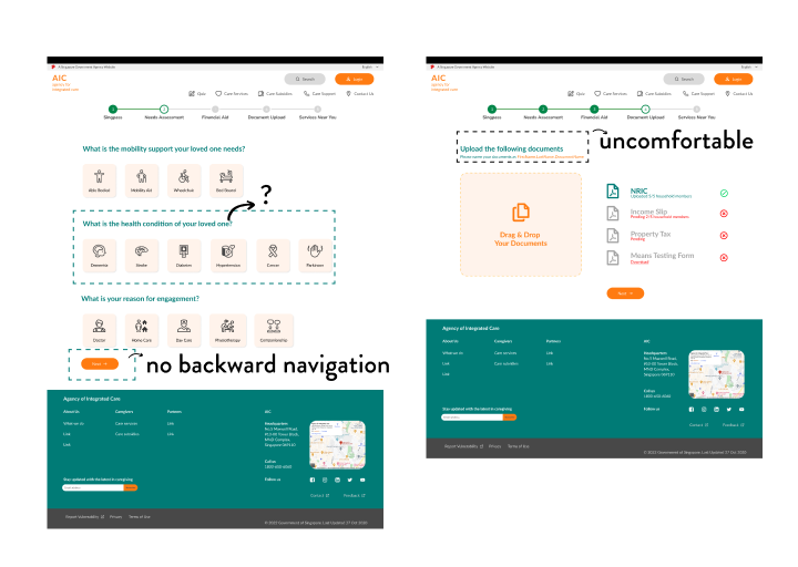
All users felt uncomfortable uploading personal documents. 80% of users wanted to navigate to previous pages
60% of users did not know their loved one’s conditions
Share icon is too small - Service Providers would use it as it is the fastest way to send resources digitally to clients
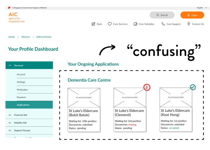
All users wanted more visibility on the different offerings and prices of care centres. They also were confused about how to navigate between pages for applications. This points to a lack of affordance due to unclear card designs for care centres.
Final Design
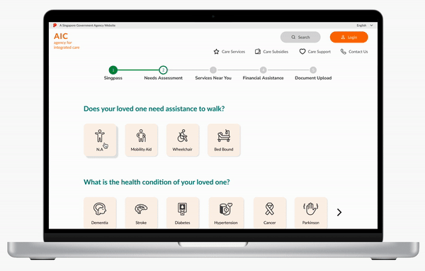
Customised Needs Assessment
match resources to patient needs
Understanding and Optimisation
An optimised 5-step process to

Streamlining
Returning clarity and control
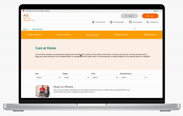
With a revamped information architecture and cards, day care managers can quickly scroll, select, and share resources digitally to clients.
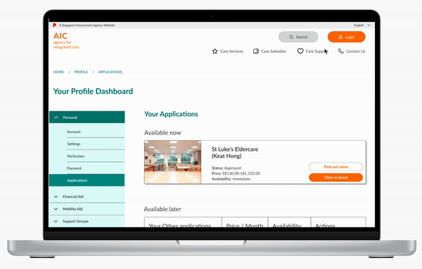
Portal to check applications

quick overview, providing relief
With a few clicks, returning caregivers have quick oversight of the various
offerings of care centres, and statuses existing applications for loved ones.