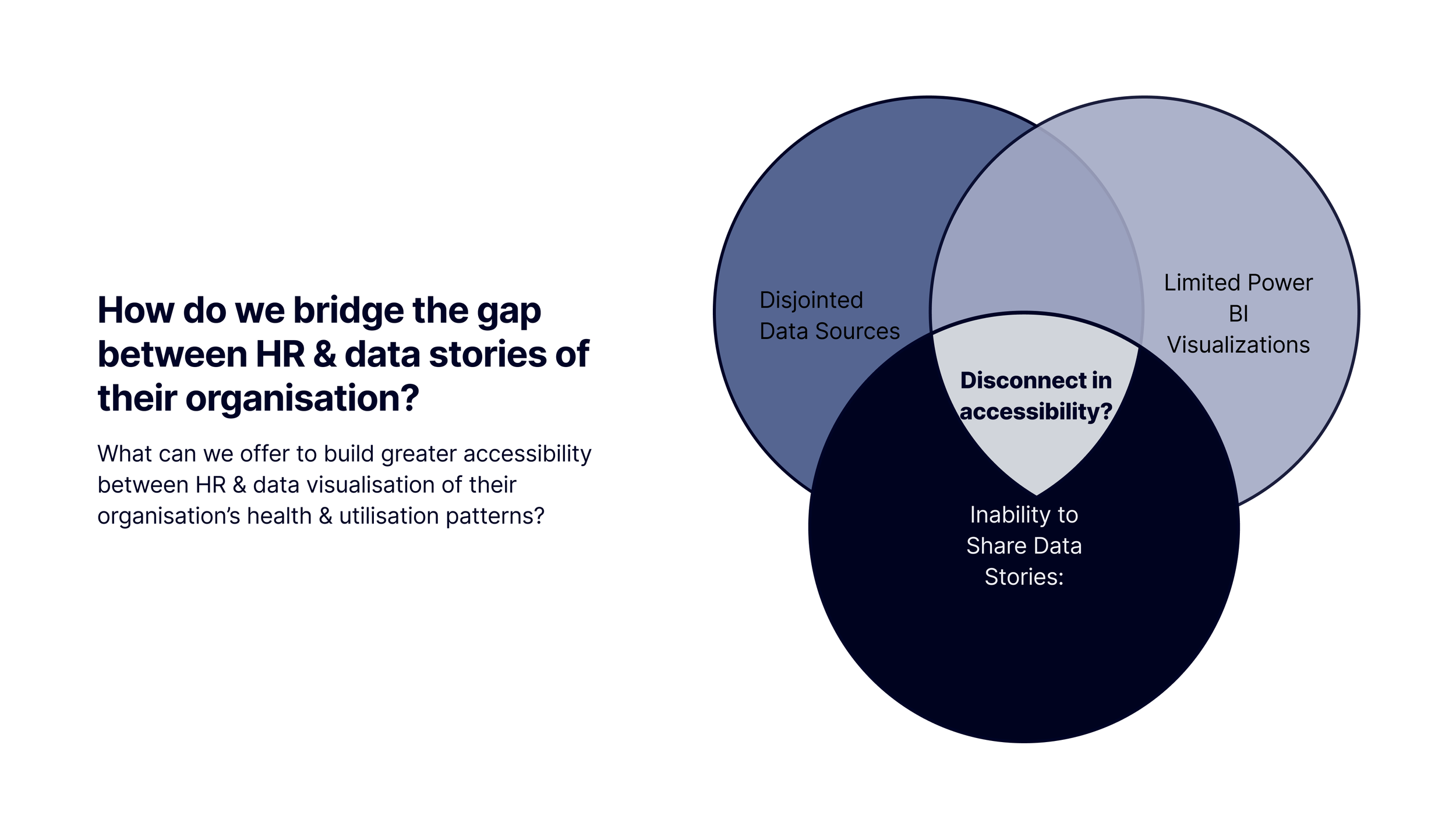
The Challenge
How do we bridge the gap between HR, stakeholders, and disjointed data stories about their organisation?
My Role
Lead Product Designer & Researcher
The Team
XFN collaboration with Product, Engineering & Data teams
When
May-Aug 2024
Impact
B2B HR Analytics Dashboard POC validated with 6 figure commercial value per annum
Pitch-ready designs & live product (POC) used by Sales teams for prospecting with potential B2B Clients.
Disjointed Data Stories
Creating a Hybrid Dashboard with Cross Functional Teams
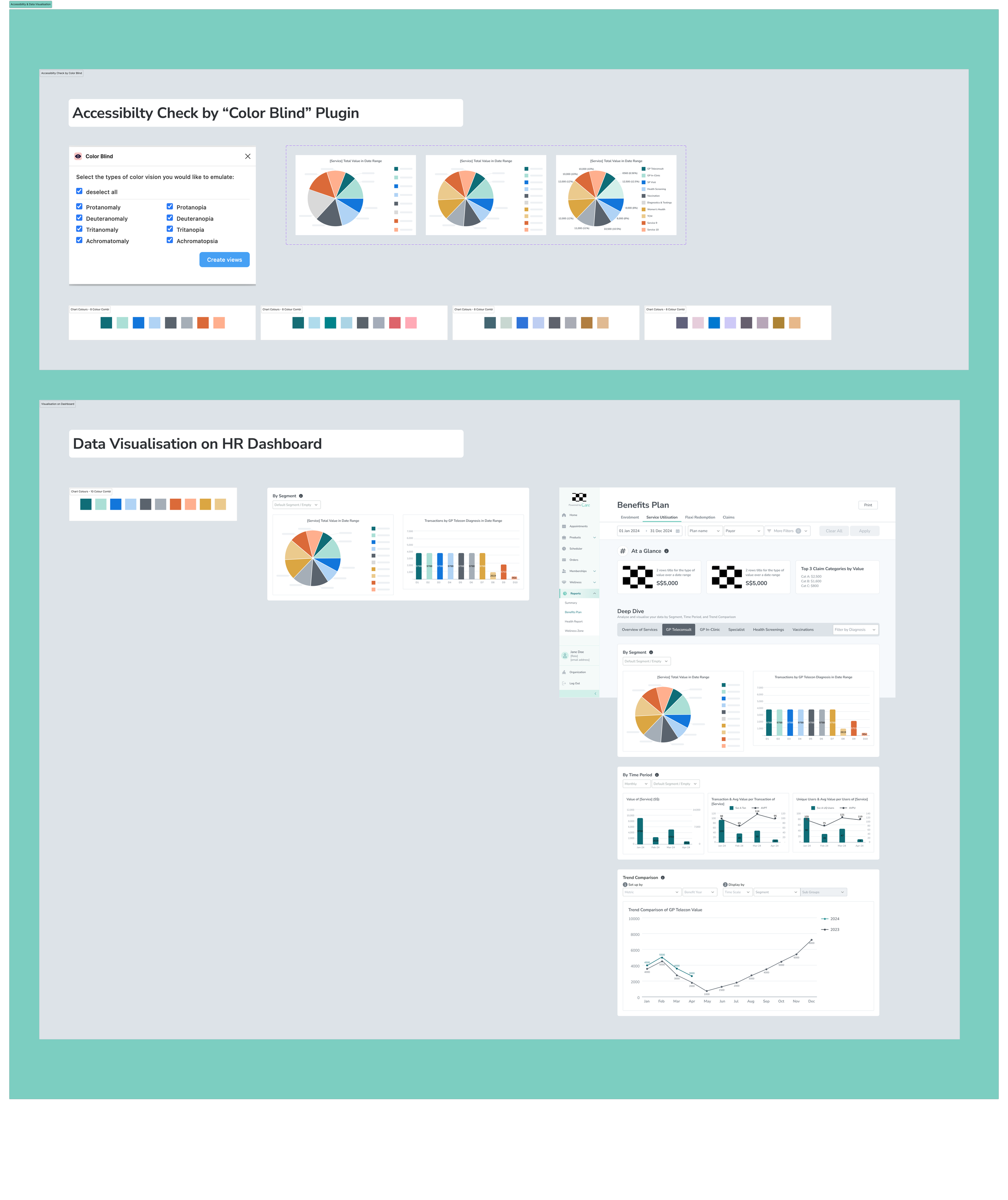
As the lead product designer, I conducted the end-to-end competitive & UX research, Figma designs, colour palette & data visualisation references, and prototypes. Due to lean resources and tight timelines for pitching, the cross functional teams agreed to a hybrid solution where the final proof-of-concept (POC) used embedded data visualisation from PowerBI. This tailored approach meant for more intentional collaboration between the product, engineering, data teams & me to align - The alignment of the visuals like colour and typography & typescale was especially crucial to ensure a consistent look from my Figma designs to the embedded visuals from PowerBI. Some of my high-fidelity designs and prototypes were used for prospective to potential clients, apart from the product development for the POC phase 1.

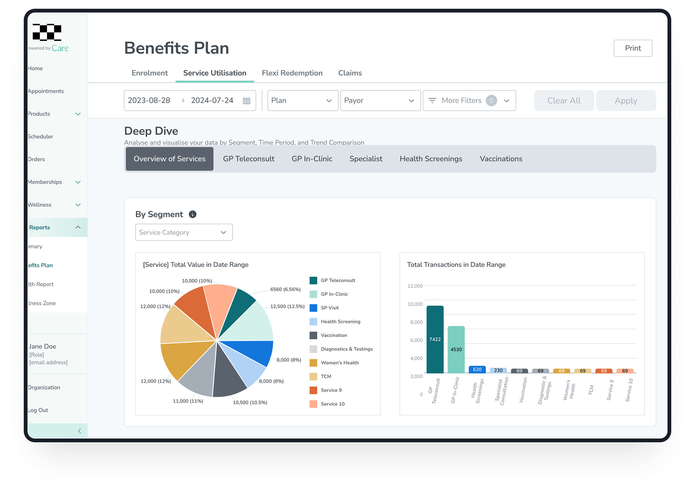


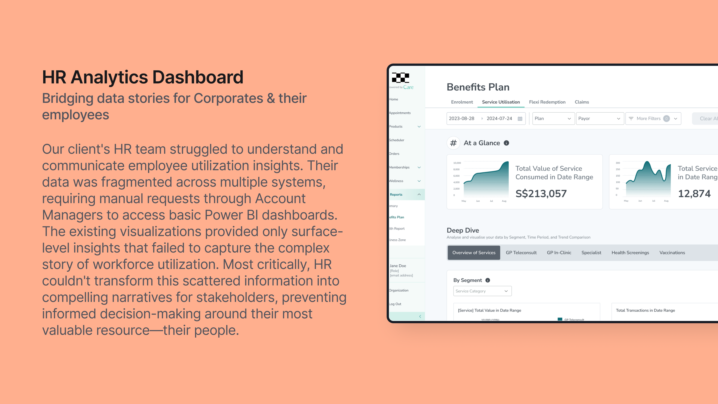
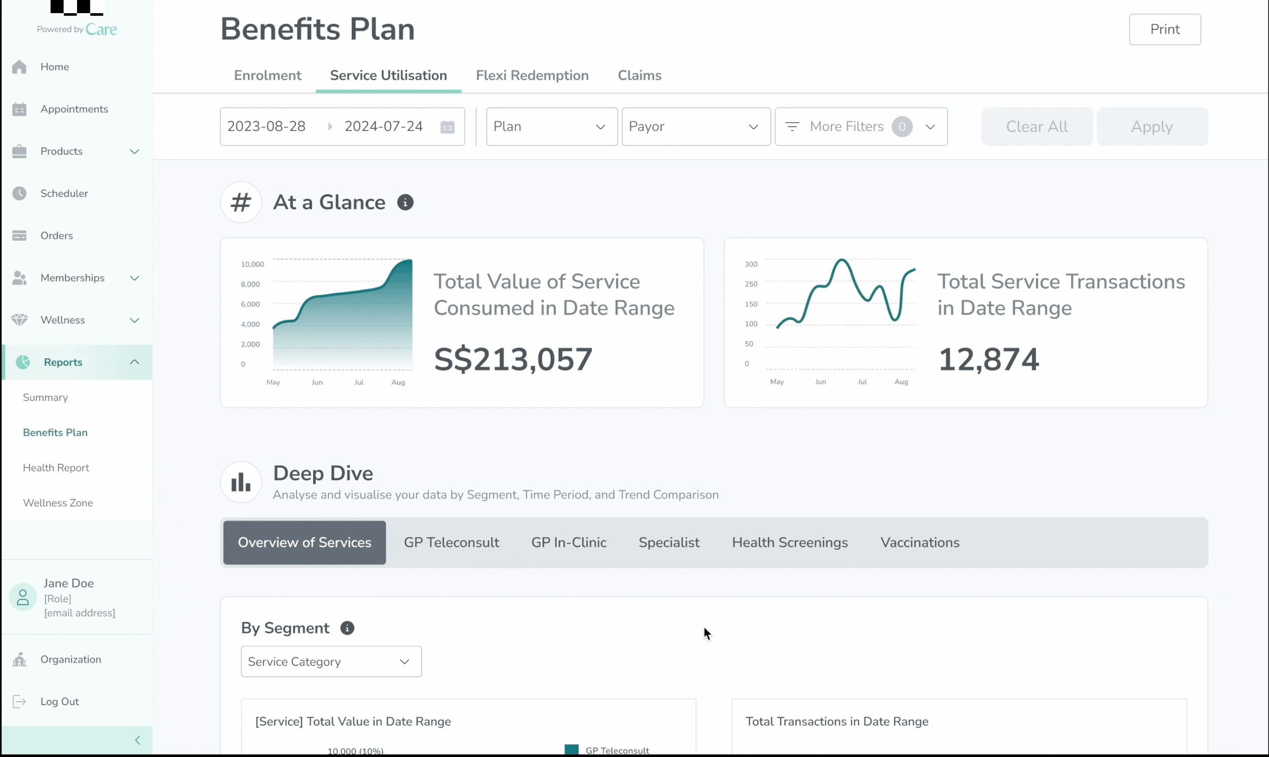
From Scattered Sources to Strategic Stories: Redesigning Key Data Visualizations Across Benefits Plan, Health Report, Wellness Zone
Health Report
Our dashboard visualizes key employee health metrics—BMI, blood pressure, and fasting blood glucose—enabling HR to analyze workforce wellness across departments, age groups, and corporate plans. This empowers data-driven wellness program planning, targeted health interventions, and strategic resource allocation to support both employee wellbeing and business objectives.


Wellness Zone
Our wellness analytics dashboard tracks employee participation rates in wellness activities and points redemption patterns, providing HR with comprehensive engagement insights. By analyzing participation trends across different programs and demographics, HR can identify opportunities to boost employee involvement, design targeted wellness campaigns, and foster a proactive organizational culture around health and wellbeing.

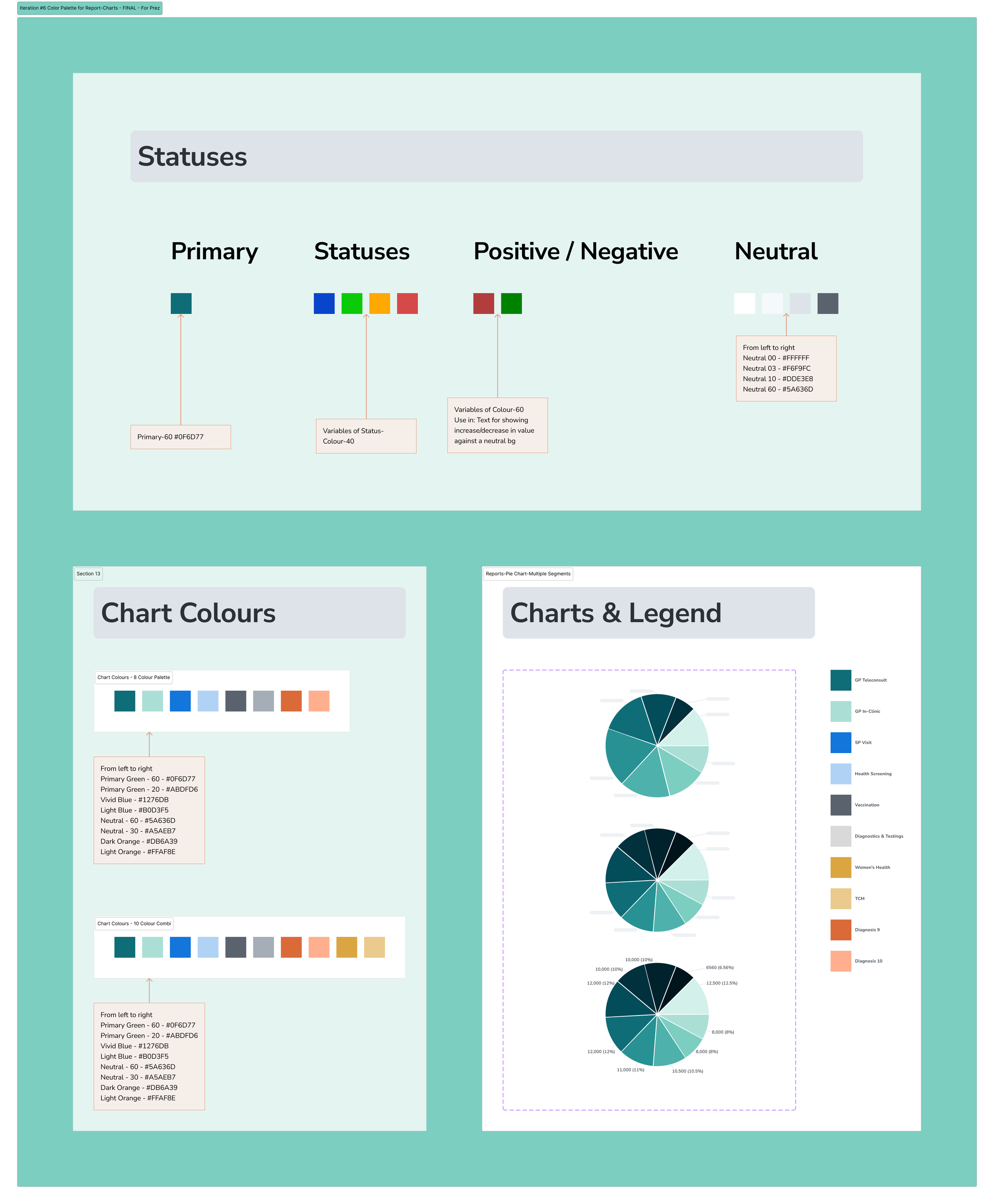
Our design system evolved through collaborative feedback sessions with cross-functional teams. Product-Design focused on ensuring colors were vibrant enough to impress while maintaining distinctiveness for data visualization and optimal readability. Engineering and Data teams evaluated technical feasibility, addressing visualisation compatibility and limitations within embedded Power BI charts to ensure seamless implementation across all dashboard components.
HR Dashboard Design System Sample